Is Photojournalism Art?
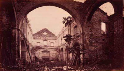
Photo by: Eadward Muybridge
Circa 1875
Texture: The texture in the photograph is hard to perceive because the contrast is not balance but looking thoroughly and zooming in the photo, it will appear rough. Its texture represented by the walls and the people below is bringing life to the image. This texture is engaging the sense of touch.
Depth of Field: The photographer used the maximum depth of field. Which makes the image difficult to distinguish because it didn't focus on the main subject. I believe the principle was not used in the correct manner since majority of the image is focused on the building not the people.
Background detracts from composition: At first I thought the photo was only focusing on the structure of the building until I saw the people below. Which makes the essence of this image confusing for the viewers to comprehend whether it is focused on the people or the building.
Photo by: Margaret Bourke-White
Circa 1934
Keep it Simple: The background is cluttered especially in the front portion of the image. The woods made it look cluttered. However, these clutters brought the sense of reality of life.
Black and White: The photographer back then at this period has probably no option other than to take it in black and white color. However, this color made the image less distracting to the viewers and prompt the emotional state of the subject. It could've been a perfect black and white image if there are no clutters in front of the image.
Quality of light: The lighting is dramatic which is evoked by the black and white color and the sunlight. It is directly flashing to the subjects (house, people) that makes the quality of image clearer. However, in this image the lighting was not used with style because the shadow and highlight are being masked by the tone of black and white.
Why did I choose the image?: I chose this image because of the emotional state it delivers to the viewers. It is nearly perfect black and white image contributed by the sky and few subjects. Which makes it easier to focus. The image is simple but it tells a lot of story.
Photo by: Raymond Depardon
Circa 1980
What feelings does the image create? The image created the feeling of loneliness and peace. It captured my attention because the subject (little girl) was really focused in the image despite of the amazing background she had. Additionally, the uniformity of the building and idleness of the subject in the photograph is bringing peace of mind to the viewers.
Why did I choose the image? I chose this image because it has many elements that we can consider for the observation. The texture, color, depth of field, background, the use of lines, contrast, quality of light are just few of my observation from this image that I thought can be modified by our evolving technology. Which could make the purpose behind the photograph more engaging to the viewers.
Photo by: Margaret Bourke-White
Circa 1934
Keep it Simple: The background is cluttered especially in the front portion of the image. The woods made it look cluttered. However, these clutters brought the sense of reality of life.
Black and White: The photographer back then at this period has probably no option other than to take it in black and white color. However, this color made the image less distracting to the viewers and prompt the emotional state of the subject. It could've been a perfect black and white image if there are no clutters in front of the image.
Quality of light: The lighting is dramatic which is evoked by the black and white color and the sunlight. It is directly flashing to the subjects (house, people) that makes the quality of image clearer. However, in this image the lighting was not used with style because the shadow and highlight are being masked by the tone of black and white.
Why did I choose the image?: I chose this image because of the emotional state it delivers to the viewers. It is nearly perfect black and white image contributed by the sky and few subjects. Which makes it easier to focus. The image is simple but it tells a lot of story.
Circa 1980
What feelings does the image create? The image created the feeling of loneliness and peace. It captured my attention because the subject (little girl) was really focused in the image despite of the amazing background she had. Additionally, the uniformity of the building and idleness of the subject in the photograph is bringing peace of mind to the viewers.
Depth of Field: I believe the image used the shallow depth of field. The girl is focused on the image. Additionally, the arrangement of the building impacts also the depth of field as it allow to focus more on the subject (girl).
Subject's Expression: The candid shot of little girl shows like she's wandering. She looks like lost, lonely, and in the middle of somewhere. However, her body language is not consistent to her facial expression thus making it challenging to tell what is happening to her.
Why did I choose the image? I chose this image because the subject is very focused in the image despite of the amazing uniformed background it has. The background could've been more attractive because of the converging line that the building is creating. Additionally, the contrast of her light cloth to the dull background enhanced the viewer's focus to her.
Why did I choose the image? I chose this image because the subject is very focused in the image despite of the amazing uniformed background it has. The background could've been more attractive because of the converging line that the building is creating. Additionally, the contrast of her light cloth to the dull background enhanced the viewer's focus to her.


Comments
Post a Comment